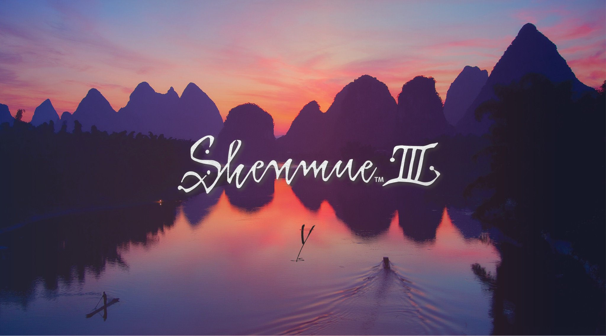
ash55 wrote: I definitely would prefer the original font, and I think it needs to appear in the game. But I understand the reason to change it on the boxart (hopefully nowhere else). I'm not too keen on slightly altering the original logo in order to make it more legible. What makes the original so great is the beautiful cursive writing, and so I don't feel it should be touched, or something similar should be created. So a completely different logo on the boxart would be preferable IMO. I tried to just think of something really simple, but sort of classic, to fit in with the theme of shenmue and this is what I came up with. Just a basic serif font almost as if it's not a logo at all, but simply a translation of the original japanese logo.


I like that idea a lot. It was interesting that Suzuki pointed to Peter's shirt and said that's the logo he wanted to go with for now. Any of your guys' creations would be eons better than that papyrus paint job