2012 Olympics
Re: 2012 Olympics
![]() by AnimeGamer183 » Wed Aug 08, 2012 8:46 pm
by AnimeGamer183 » Wed Aug 08, 2012 8:46 pm
I still dont understand that logo at all.
-

AnimeGamer183 - Shenmue III

- Joined: April 2003
Re: 2012 Olympics
![]() by AnimeGamer183 » Wed Aug 08, 2012 11:06 pm
by AnimeGamer183 » Wed Aug 08, 2012 11:06 pm
after closer inspection, L on the top left is for London, the olympic rings. then 12 underneath? Its barely legible.
-
AnimeGamer183 - Shenmue III
- Joined: April 2003
Re: 2012 Olympics
![]() by Who Really Cares? » Thu Aug 09, 2012 4:37 am
by Who Really Cares? » Thu Aug 09, 2012 4:37 am
Its the problem when you pick a kids design for a logo.
-

Who Really Cares? - Shenmue III
- Joined: December 2004
- Location: Beyond The Wall
- XBL: Baihu1983
- Favorite title: Shenmue II
- Currently playing: TitanFall
Re: 2012 Olympics
![]() by Neo Matrix » Thu Aug 09, 2012 7:55 am
by Neo Matrix » Thu Aug 09, 2012 7:55 am
No... I don't know what will make it clearer using fonts on here but it's:AnimeGamer183 wrote:after closer inspection, L on the top left is for London, the olympic rings. then 12 underneath? Its barely legible.
20
12
That's why the "London" is in the first 2, the rings are just there because it's the Olympics.
-
Neo Matrix - "After Burner...Great!"

- Joined: May 2003
- Location: London, England
- PSN: Zeokage
- XBL: Zeokage
- Favorite title: Shenmue
- Currently playing: Naruto: UNS Generations
Re: 2012 Olympics
![]() by Who Really Cares? » Thu Aug 09, 2012 10:16 am
by Who Really Cares? » Thu Aug 09, 2012 10:16 am
All these falls in BMX are awesome and lucky no ones been seriously hurt.

-
Who Really Cares? - Shenmue III
- Joined: December 2004
- Location: Beyond The Wall
- XBL: Baihu1983
- Favorite title: Shenmue II
- Currently playing: TitanFall
Re: 2012 Olympics
![]() by Bluecast » Thu Aug 09, 2012 11:47 am
by Bluecast » Thu Aug 09, 2012 11:47 am
Neo Matrix wrote:No... I don't know what will make it clearer using fonts on here but it's:AnimeGamer183 wrote:after closer inspection, L on the top left is for London, the olympic rings. then 12 underneath? Its barely legible.
20
12
That's why the "London" is in the first 2, the rings are just there because it's the Olympics.
It's the worst fucking logo ever made. I'm not just saying Olympics I mean in the history of this world. Unless they wanted Lisa to give bart a blowjob then it's the most disturbing.
-

Bluecast - Jean Valjean

- Joined: August 2003
- PSN: Ryudoadam
- XBL: Dogi99
- Nintendo FC: Segata
- Steam: Ryudo2k9
- Favorite title: Shenmue
- Currently playing: Some weeb game as always.
Re: 2012 Olympics
![]() by Who Really Cares? » Thu Aug 09, 2012 12:42 pm
by Who Really Cares? » Thu Aug 09, 2012 12:42 pm
Only the real logo doesn't have that color scheme.
Most see it simply as 2012
Most see it simply as 2012
-
Who Really Cares? - Shenmue III
- Joined: December 2004
- Location: Beyond The Wall
- XBL: Baihu1983
- Favorite title: Shenmue II
- Currently playing: TitanFall
Re: 2012 Olympics
![]() by Bluecast » Thu Aug 09, 2012 12:57 pm
by Bluecast » Thu Aug 09, 2012 12:57 pm
Who Really Cares? wrote:Only the real logo doesn't have that color scheme.
Most see it simply as 2012
It never looked like anything other than spilled Pepto bismal,until I saw that posted somewhere else.
They must have had 1st graders design the thing. Since 2000 almost everyone has had a shitty logo but none nearly as bad as the London one. Only 2 since 2000 have had a decent logo that makes any sense.


-
Bluecast - Jean Valjean
- Joined: August 2003
- PSN: Ryudoadam
- XBL: Dogi99
- Nintendo FC: Segata
- Steam: Ryudo2k9
- Favorite title: Shenmue
- Currently playing: Some weeb game as always.
Re: 2012 Olympics
![]() by Who Really Cares? » Thu Aug 09, 2012 1:05 pm
by Who Really Cares? » Thu Aug 09, 2012 1:05 pm
Im sorry but how does that not make sense?
http://www.london2012.com/
London 2012 with the Olympic rings on it.
On their own as simply 2012 yeah its odd but then so would the 2 you posted if you took away the rings and name parts.
http://www.london2012.com/
London 2012 with the Olympic rings on it.
On their own as simply 2012 yeah its odd but then so would the 2 you posted if you took away the rings and name parts.
-
Who Really Cares? - Shenmue III
- Joined: December 2004
- Location: Beyond The Wall
- XBL: Baihu1983
- Favorite title: Shenmue II
- Currently playing: TitanFall
Re: 2012 Olympics
![]() by Bluecast » Thu Aug 09, 2012 1:19 pm
by Bluecast » Thu Aug 09, 2012 1:19 pm
If you have to explain what it looks like then it's a shitty logo. Don't defend it you earlier bashed it. I have never seen anyone EVER like it. it's shit.
-
Bluecast - Jean Valjean
- Joined: August 2003
- PSN: Ryudoadam
- XBL: Dogi99
- Nintendo FC: Segata
- Steam: Ryudo2k9
- Favorite title: Shenmue
- Currently playing: Some weeb game as always.

Re: 2012 Olympics
![]() by Who Really Cares? » Thu Aug 09, 2012 1:44 pm
by Who Really Cares? » Thu Aug 09, 2012 1:44 pm
Bluecast wrote:If you have to explain what it looks like then it's a shitty logo. Don't defend it you earlier bashed it. I have never seen anyone EVER like it. it's shit.
Its the problem when you pick a kids design for a logo.
That's not me bashing anything. Just me saying its not always wise to let a kid design something. The kid would not have been thinking ill do Lisa blowing someone. And again when i see a total purple/white/red or what ever version of it i don't think the BJ thing at all.
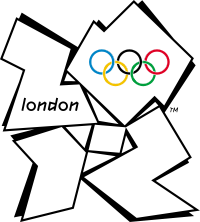
As i said the real logo has London and the rings on it so no one would need it explained unless they are a bit slow.
And again if you took away the Athens 2004 and the rings away no one would have a clue that was for the Olympics so going off what you said its a shitty logo, same with the salt lake one and every other logo ever made.
Women's hockey
-
Who Really Cares? - Shenmue III
- Joined: December 2004
- Location: Beyond The Wall
- XBL: Baihu1983
- Favorite title: Shenmue II
- Currently playing: TitanFall
Re: 2012 Olympics
![]() by Who Really Cares? » Sat Aug 11, 2012 4:04 pm
by Who Really Cares? » Sat Aug 11, 2012 4:04 pm
If this is Bolts last Olympics his going out well on top.
-
Who Really Cares? - Shenmue III
- Joined: December 2004
- Location: Beyond The Wall
- XBL: Baihu1983
- Favorite title: Shenmue II
- Currently playing: TitanFall
Re: 2012 Olympics
![]() by south carmain » Sat Aug 11, 2012 4:52 pm
by south carmain » Sat Aug 11, 2012 4:52 pm
anyone see that Argentinian hockey player get hit in the head? she must of needed quite a few stitches after a cut like that
-

south carmain - Comrade of the motherland

- Joined: February 2012
- Favorite title: Shenmue IIx
- Currently playing: okami hd
Re: 2012 Olympics
![]() by Who Really Cares? » Sun Aug 12, 2012 4:17 am
by Who Really Cares? » Sun Aug 12, 2012 4:17 am
Yeah they take some nasty knocks in that sport and i belive one of GB's women had her jaw broken.
-
Who Really Cares? - Shenmue III
- Joined: December 2004
- Location: Beyond The Wall
- XBL: Baihu1983
- Favorite title: Shenmue II
- Currently playing: TitanFall
Who is online
Users browsing this forum: No registered users and 1 guest
Powered by phpBB © 2000-ShenmueDojo.net